SM Caen Crest History
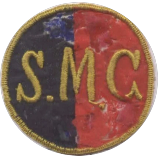
The earliest known crest of Stade Malherbe Caen, used from 1913 to 1930, was a simple circular badge divided into the club's traditional red and blue halves. The gold initials S.M.C. appeared prominently across the centre, reflecting the club's origins shortly after its foundation. Like many French clubs of the era, the emblem was embroidered directly onto players' shirts and served primarily as an identification badge.
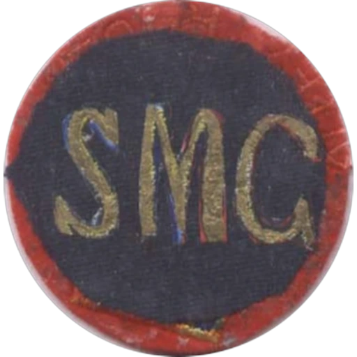
Between 1930 and 1934, the club adopted an even simpler version of the circular emblem. The badge retained the gold SMC initials but abandoned the vertical colour division in favour of a predominantly dark blue background with a red outer border. The redesign reflected a cleaner appearance while maintaining the club's traditional colours.
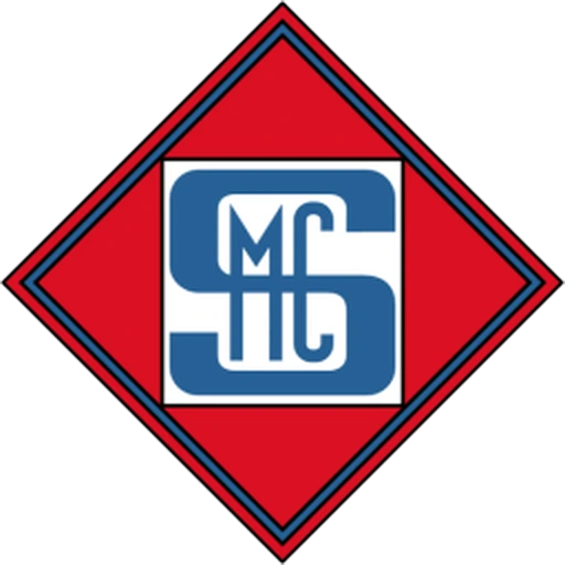
In 1934, following the club's professionalisation, Stade Malherbe introduced one of its most iconic historic crests. The new emblem featured a red diamond outlined in blue, containing an interlocking SMC monogram in white and blue. This distinctive Art Deco-inspired design remained virtually unchanged for more than 50 years, becoming synonymous with the club's identity throughout much of the twentieth century.
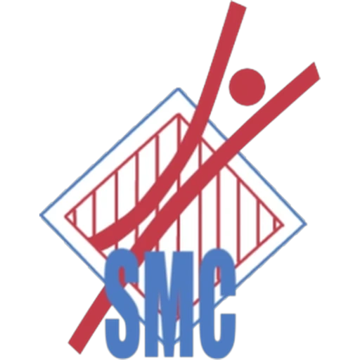
A brief redesign appeared in 1988, introducing a highly modern, abstract logo. The badge combined the initials SMC with sweeping red diagonal lines and a stylised geometric motif intended to represent movement and ambition. Although innovative for its time, the design lasted only a single season before the club opted for a more traditional identity.
In 1989, SM Caen unveiled a crest inspired by the city's maritime heritage. The new rectangular badge featured a stylised Viking longship sailing above blue waves, while the spires of Caen rose in the background. The inscription "Stade Malherbe Caen – Calvados Basse-Normandie" emphasised the club's regional identity. This logo accompanied Caen during its emergence as an established Ligue 1 club throughout the 1990s.
A refined version followed in 2006, placing the Viking longship inside a white shield while simplifying the typography and overall composition. The redesign modernised the badge without altering its core symbols and remained in use for only one season.
In 2007, the club adopted a circular crest centred on the same Viking ship sailing across stylised red and blue waves. The words "Stade Malherbe Caen – Calvados Basse-Normandie" surrounded the emblem, creating a cleaner and more contemporary visual identity while preserving the regional symbolism introduced in 1989.
To celebrate the club's centenary in 2013, SM Caen introduced a commemorative crest featuring a shield divided into red and blue halves, with the founding year 1913 displayed prominently across the centre. A ribbon bearing the club's name completed the design, which remained in use for three seasons after receiving widespread approval from supporters.
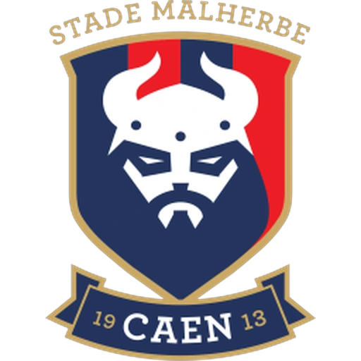
Since 2016, Stade Malherbe Caen has used a completely redesigned crest centred on a stylised Viking face wearing a horned helmet. Although historical Vikings did not wear horned helmets, the symbol represents the club's long-standing nickname, Les Vikings, and Normandy's Scandinavian heritage. Rendered in the club's traditional red, blue, gold, and white colours, the shield also incorporates the club's name and founding year.