Cúcuta Deportivo Crest History
The crest of Cúcuta Deportivo is built around a remarkably simple and recognisable identity: the club's traditional red and black colours, the initials C.D., and a championship star representing the greatest achievement in the club's history.
The versions shown here cover the club's most recent period, from 2022 to the present, and demonstrate a clear movement towards a cleaner and more minimalist visual identity.
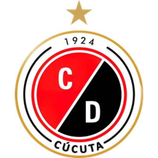
The 2022–2024 crest used a circular structure dominated by red, black, white and gold.
At the centre was a circle divided diagonally into two sections: red in the upper-left half and black in the lower-right half.
The white initials C and D, representing Cúcuta Deportivo, appeared separately within the two coloured sections.
This red-and-black combination is fundamental to the club's identity and directly reflects the traditional colours worn by the team, which have also produced the nickname Rojinegros — The Red and Blacks.
Surrounding the central emblem were several concentric rings, giving the badge a layered appearance.
The outer white ring contained the foundation year 1924 at the top and the name CÚCUTA at the bottom, explicitly connecting the club with its home city.
Small black decorative elements on either side helped balance the circular composition.
The entire badge was surrounded by a thin golden outline, adding a prestigious accent to the otherwise red, black and white design.
Above the crest appeared a single gold star.
The star commemorates Cúcuta Deportivo's greatest domestic achievement: winning the Colombian league championship in 2006.
That championship was the club's first top-flight national title and consequently became an important part of its visual identity.
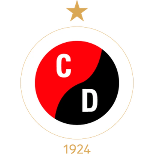
In 2024, Cúcuta Deportivo introduced a substantially simplified crest.
The multiple rings, decorative lines and prominent CÚCUTA inscription were removed, leaving a much cleaner circular emblem.
At its centre remains the familiar red-and-black composition, but the dividing line has changed from a straight diagonal into a flowing curved form.
This creates an almost interlocking appearance, with the red and black sections wrapping around one another while remaining clearly separated.
The white initials C and D remain positioned inside the red and black fields respectively, preserving an immediate connection with the previous badge.
A thin gold circular outline surrounds the central design, while the foundation year 1924 has been moved outside the badge and placed beneath it in gold.
The championship star also remains above the crest, ensuring that the historic 2006 title continues to be represented.
Although the 2024 redesign is considerably more minimalist, it retains the three elements most closely associated with the club: C.D., red and black, and the championship star.
The removal of the full CÚCUTA name means that the modern emblem relies more heavily on the strength and familiarity of the club's initials and colours.
Red and black have long been central to Cúcuta Deportivo's identity. They appear not only on the crest but also on the club's traditional shirts and are responsible for the widely used nickname Rojinegros.
The club's other famous nickname, Los Motilones, connects Cúcuta Deportivo more broadly with the history and regional identity of Norte de Santander.
The single gold star has particular significance because the 2006 championship transformed the club's history. The title was followed by Cúcuta's remarkable run to the semi-finals of the 2007 Copa Libertadores, one of the greatest international campaigns by a Colombian club outside the country's traditional giants.