Red Bull Bragantino Crest History
The crest history of Red Bull Bragantino can be divided into two distinct eras: the long history of Clube Atlético Bragantino, characterised by its traditional black-and-white colours, and the modern Red Bull era that began after the partnership with Red Bull in 2019. For most of its existence, the club's identity centred on striped shields and the initials CAB, before undergoing a complete transformation in 2020.
The original 1928 crest was extremely simple. It consisted of a solid black oval containing the large white initials CAB, representing Clube Atlético Bragantino. The elongated lettering gave the young club a straightforward identity without any additional football imagery or decoration.
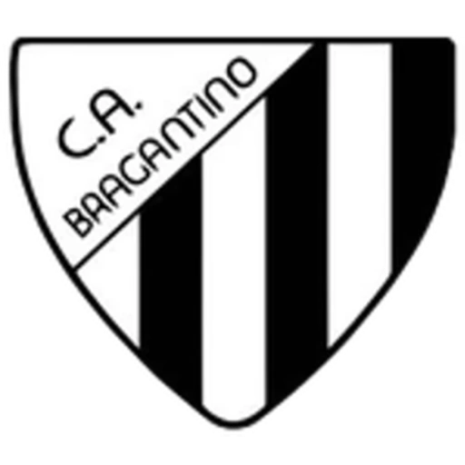
By 1950, Bragantino had adopted the black-and-white striped identity that would define the club for decades. The new shield featured vertical black and white stripes, while a diagonal white section in the upper-left corner carried the name C.A. BRAGANTINO. This established the basic structure from which many later crests developed.
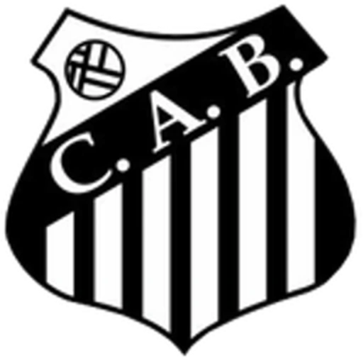
Between 1960 and 1965, the shield became more elaborate and acquired the curved outline that would become familiar in later versions. A black diagonal band containing the initials C.A.B. crossed the upper portion, while vertical black-and-white stripes filled the lower section. A football appeared in the white upper-left area.
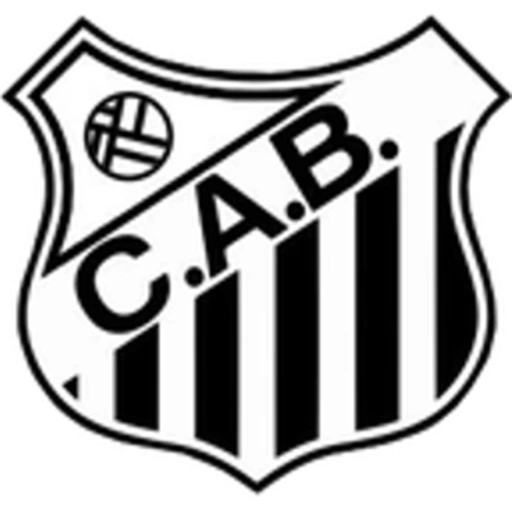
The 1965 version refined this concept. The shield received a double outline and a slightly broader shape, while the football, diagonal band, C.A.B. initials and vertical stripes remained the principal elements. The result was a cleaner and more balanced interpretation of the established Bragantino identity.
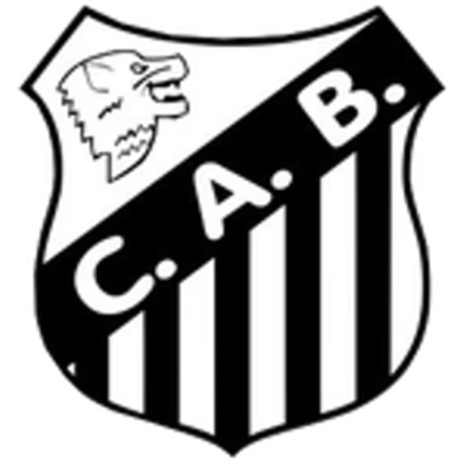
In 1975, an unusual variation appeared in which the football was replaced by the head of an animal, while the diagonal C.A.B. band and black-and-white stripes were retained. Although short-lived compared with other versions, it represented one of the most distinctive experiments in the club's crest history.
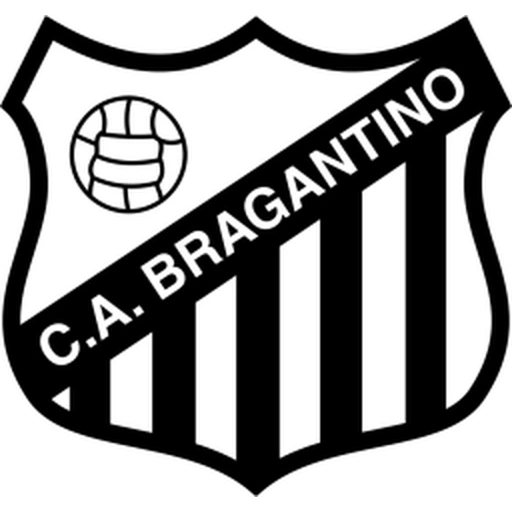
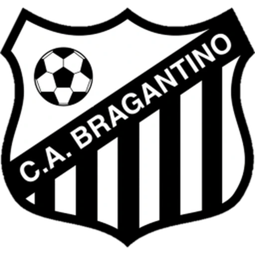
By 1995, Bragantino had returned fully to the traditional football-based design. The crest featured a black-and-white striped shield crossed by a diagonal black band containing the complete name C.A. BRAGANTINO, while a football occupied the white upper-left section. This design became closely associated with the club during one of the most important periods in its history.
Variations of this traditional badge were used through the following decades, including the 1995–2020 version shown here. Although proportions, outlines and details were refined, the essential elements remained unchanged: the black-and-white shield, vertical stripes, diagonal club-name band and football.
A fundamental change occurred after Red Bull became involved with the club in 2019. During the initial phase of the partnership, the traditional Clube Atlético Bragantino identity was still used, but the project soon developed into a broader transformation of the club's name, branding and visual identity.
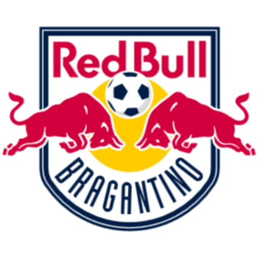
In 2020, the historic black-and-white crest was replaced by an entirely new Red Bull Bragantino badge. The design follows the wider Red Bull football identity, with two red bulls charging toward a football positioned in front of a yellow disc. The Red Bull wordmark appears prominently above, while BRAGANTINO is written across the curved lower section.
The modern crest also introduced a completely different colour palette. Red, yellow, white and dark blue replaced the black and white that had characterised Clube Atlético Bragantino for more than ninety years. Unlike earlier redesigns, this was therefore not simply an evolution of the existing shield but an almost complete replacement of the club's traditional visual language