Gaziantep FK Crest History
The crest of Gaziantep FK reflects the club's transformation from a municipal football team into the leading professional club representing the city of Gaziantep. The club's visual identity changed significantly during the 2010s, moving from the traditional blue-and-white municipal colours to the distinctive red, black and white identity associated with Gaziantep FK today.
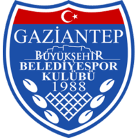
Between 2011 and 2017, when the club competed as Gaziantep Büyükşehir Belediyespor, the crest featured a large blue shield outlined in white. The full municipal club name appeared prominently across the badge together with the founding year 1988. A small Turkish crescent and star appeared at the top, while decorative elements in the lower section reflected the club's connection with the municipality and the city of Gaziantep.
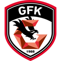
A major transformation took place in 2017, when the club was renamed Gazişehir Gaziantep FK as part of an effort to create a stronger football identity for the city. The traditional blue crest was replaced by a completely new red, black and white shield, colours strongly associated with football in Gaziantep.
The redesigned badge introduced a prominent black falcon, representing strength, determination and ambition. Behind the bird is a stylised geometric letter "G", referring directly to Gaziantep, while the founding year 1988 remains at the bottom of the shield. The initials at the top were subsequently adapted to GFK following the adoption of the name Gaziantep Futbol Kulübü.