Querétaro FC Crest History
The crest history of Querétaro Fútbol Club reflects the gradual development of the club's identity from a simple representation of the city into the familiar blue, black and white colours and the rooster symbol associated with Los Gallos Blancos.
The original 1950–1957 crest was extremely simple, consisting of a large blue letter Q representing Querétaro. It established blue as an important part of the club's visual identity.
Between 1957 and 1961, the Q remained the basic shape, but a rooster was introduced inside it. This was an important development because the rooster would eventually become one of the club's principal symbols and the source of the nickname Gallos Blancos, White Roosters.
The 1961–1965 crest retained the circular Q concept but introduced a more detailed central design. The name Club de Fútbol Querétaro appeared around the emblem, giving the badge a more conventional football-club identity.
From 1965 to 1990, Querétaro used another circular design built around a stylised blue Q. The words CLUB DE FÚTBOL QUERÉTARO A.C. surrounded the badge, while a small football was incorporated into the central symbol.
A major redesign appeared in 1991. The club adopted a traditional shield with blue-and-black vertical stripes, a football at the centre and the initials QFC across the top. The design established the striped identity that remains closely associated with Querétaro today.
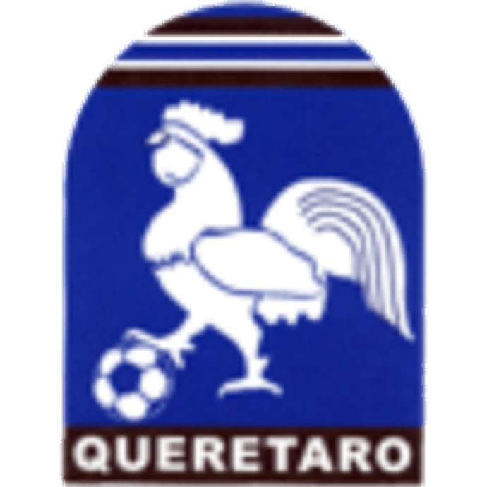
Between 1994 and 1997, the club experimented again with the rooster. The 1994–1997 crest showed a white rooster standing above a football against a blue background, with the name QUERÉTARO displayed prominently below.
A special 1995 variation used a more stylised white rooster on a purple-blue shield. These rooster-based badges directly emphasised the club's increasingly established Gallos Blancos identity.
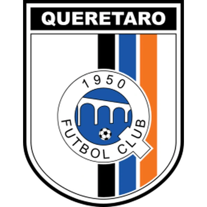
In 1999, Querétaro introduced the basic structure of its modern crest. A white shield containing black, blue and white vertical stripes surrounded a circular central emblem. The year 1950 appeared above the stylised historic Q symbol, reconnecting the modern badge with the club's earliest identity.
The 1999–2013 crest therefore combined several generations of Querétaro symbolism: the historic Q, the foundation year, the football and the vertical stripes that had become associated with the team's playing colours.
In 2013, the crest was modernised without abandoning this basic structure. The shield became cleaner and more symmetrical, while the central circular badge and 1950 remained.
The 2013–present crest also introduced an orange stripe alongside the traditional black and blue vertical bands, adding a distinctive modern accent to the club's established colour scheme.