CF Monterrey Crest History
The crest history of Club de Fútbol Monterrey reflects the development of the club from a regional team into one of the major institutions of Mexican football. Throughout most of its history, blue and white have dominated the identity, while the letter M has gradually become the defining element of the badge.
The 1950–1960 crest combined a football with the mountainous landscape of Monterrey. The words Club de Fútbol Monterrey were incorporated into the design, directly connecting the team with its home city and the surrounding mountains of Nuevo León.
Between 1960 and 1970, Monterrey adopted a shield featuring blue-and-white vertical stripes, a football and a stylised mountain at the top. The design established several elements that would remain important in later crests.
The 1970–1991 crest refined this concept. The name Club de Fútbol Monterrey A.C. appeared prominently, while the mountain symbol, vertical stripes and football remained. This badge strongly emphasised both the club's geographical identity and its traditional colours.
A radical simplification came in 1991. The crest was replaced by a large dark-blue M, accompanied simply by the word Monterrey. The letter's shape also evoked the mountainous landscape surrounding the city.
In 2000, Monterrey introduced the basic shield that continues to define the club today. A large stylised M was placed inside a blue-and-white striped shield, combining the simplified identity of the 1990s with the traditional striped colours of Los Rayados.
Following Monterrey's Clausura 2003 championship, a second league-title star was added above the crest. As further championships followed, additional stars appeared in subsequent versions.
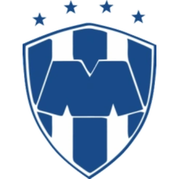
The 2009–2010 crest displayed three stars following the Apertura 2009 championship, while the 2010–2011 version carried four after Monterrey captured another title in Apertura 2010.
During Monterrey's extraordinary period of international success, the badge was also accompanied by stars representing its achievements. The 2011–2012 version illustrates how the club increasingly used stars around the crest to commemorate its growing collection of domestic and continental honours.
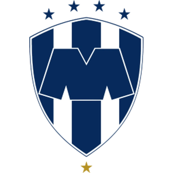
In 2012, Monterrey simplified its visual identity once again. The championship stars were removed from the standard badge, leaving the distinctive M-shaped monogram inside the blue-and-white striped shield.
The 2012–present crest has remained remarkably stable. Its dark navy colouring, white sections and geometric M create a clean modern identity while preserving the striped appearance associated with the nickname Los Rayados, The Striped Ones.