Birmingham City FC Crest History
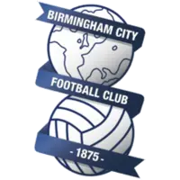
Founded in 1875 as Small Heath Alliance, Birmingham City Football Club has used a variety of badges throughout its history. While the club’s earliest crests were based on Birmingham’s civic heraldry, its identity today is defined by the iconic “globe and ball” emblem, one of the most distinctive and recognisable badges in English football.
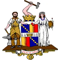
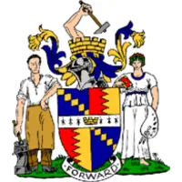
The origins of Birmingham City’s crest can be traced to the club’s transformation from a local team representing the Small Heath district into a club seeking to represent the city as a whole. Following the adoption of the name Birmingham F.C. in 1905, the club began using the coat of arms of Birmingham as its principal symbol. The civic badge reflected the club’s growing status and connection to England’s second city.
During the club’s early decades, various versions of Birmingham’s coat of arms were used on official documents, club merchandise and occasionally on playing shirts. The heraldic designs featured traditional civic symbols associated with Birmingham’s history and development. While the exact appearance varied over time, the club maintained a strong connection to the city’s civic identity.
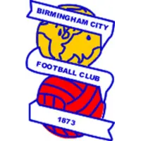
A major transformation came in 1972 when Birmingham City adopted the famous globe and ball crest. The design originated from a competition organised by the Sports Argus newspaper and was created by supporter Michael Wood. Featuring a football superimposed on a globe, together with a ribbon displaying the club name and founding year, the badge represented both the club’s heritage and its ambitions for the future.
The globe and ball design quickly became synonymous with Birmingham City and was formally introduced onto the club’s shirts during the mid-1970s. Unlike traditional heraldic crests used by many English clubs, the new emblem offered a modern and distinctive identity while retaining a strong sense of tradition. The globe symbolised a broader outlook and ambition, while the football provided an unmistakable link to the sport itself.
During the 1990s, Birmingham City experimented with several updated versions of the globe and ball badge. These refinements included colour adjustments and subtle modifications to the design, reflecting wider branding trends in English football while preserving the core elements of the original emblem.
The crest was refined further in the twenty-first century, with modernised artwork and cleaner presentation helping to improve its appearance across digital and commercial platforms. Despite these updates, the club resisted the temptation to undertake a complete redesign, recognising the strong connection supporters felt towards the globe and ball.